Fusedash vs StatPecker
Side-by-side comparison to help you choose the right AI tool.
Fusedash transforms raw data into clear dashboards so teams can act on insights instantly.
Last updated: March 4, 2026

StatPecker
StatPecker transforms your data into fast, stunning visuals and actionable insights while ensuring your privacy and.
Last updated: March 1, 2026
Visual Comparison
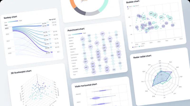
Fusedash
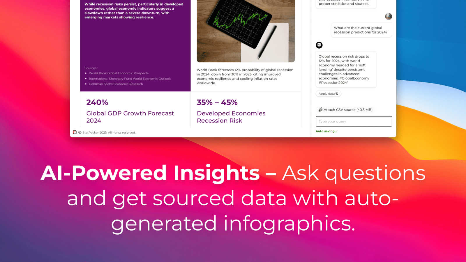
StatPecker
Feature Comparison
Fusedash
Unified AI Visualization Workspace
Fusedash shatters the limitations of single-purpose tools by integrating dashboards, charts, maps, and narrative storytelling reports into one fluid workspace. This eliminates the need to rebuild the same data logic across multiple platforms, ensuring total consistency. Teams can start from a CSV or API connection and rapidly shape views around their KPIs, customizing layouts, filters, and time ranges for different audiences without duplicating effort, which dramatically accelerates the insight-to-action cycle.
AI Chart Generator
Unlock instant clarity with the AI Chart Generator, a powerful tool that transforms your datasets into clear, actionable visuals in minutes. Simply upload a CSV or connect an API, and Fusedash intelligently assists in selecting the optimal chart type, applying meaningful comparisons, and refining labels to tell the correct data story. These AI-generated charts can be used as standalone visuals for reports or seamlessly dropped into comprehensive dashboards, making professional data visualization fast and accessible.
Smart AI Data Chat
Accelerate discovery and refinement with an integrated natural language interface. When you're unsure where to begin, simply ask questions about your data in plain English. The AI provides instant answers, suggests key metrics and breakdowns, and recommends the best chart types. You can then instantly transform these conversational insights into polished, shareable dashboard views, democratizing data exploration and empowering every team member to find answers independently.
Flexible Multi-Format Views & Storytelling
Fusedash provides the flexibility to present data in the format that best suits each audience and need. Transform a single dataset into an interactive executive dashboard, a detailed geographic map, a set of granular charts, or a contextual narrative report using Storytelling sections. This capability ensures stakeholders see precisely what matters, with the necessary context to understand what changed, why it matters, and what the next steps should be, fostering unparalleled alignment.
StatPecker
Ask Your Query
StatPecker allows users to gain instant insights from validated sources using artificial intelligence. There's no need for complex tools or technical know-how; simply ask your question and receive actionable answers that enhance your understanding of the data at hand.
Publish & Embed
With the ability to create interactive visuals, StatPecker makes it easy to integrate your infographics into blogs, articles, and websites. This feature allows users to enhance their content with dynamic visuals that engage audiences and elevate the overall quality of presentations.
Upload & Analyze CSVs
Users can upload CSV files of up to 50 MB and perform on-device analysis without the hassle of spreadsheets. This feature ensures that data remains private while allowing users to extract essential insights and generate visuals that can be shared or embedded seamlessly.
Download & Use Anywhere
StatPecker enables users to export their infographics as images, making them versatile for reports, presentations, and various other applications. This feature ensures that users can utilize their creations across different platforms, ensuring their insights reach the intended audience effectively.
Use Cases
Fusedash
Executive Leadership & Strategic Reporting
Leadership teams can escape the clutter of conflicting reports by using Fusedash to create a single, authoritative source of truth. They can monitor high-level KPIs through real-time dashboards while diving into narrative storytelling reports that provide crucial context on performance drivers. This unified view ensures strategic decisions are based on consistent, trusted data, transforming boardroom discussions from debates about numbers into focused conversations on action.
Marketing Performance & Campaign Analysis
Marketing teams can revolutionize their reporting by connecting all campaign data sources into one Fusedash workspace. They can build dynamic dashboards to track channel performance in real-time, use AI-generated charts to visualize ROI trends, and employ maps to analyze geographic engagement. The AI Chat feature allows for rapid, deep-dive analysis into audience segments, unlocking transformative insights to optimize spend and strategy on the fly.
Operational Monitoring & Real-Time Analytics
Operations and support teams can leverage Fusedash for live monitoring of critical systems and processes. By building real-time interfaces that track key operational metrics, teams can proactively identify and respond to issues. The ability to drill down into specific time periods, regions, or segments directly from the dashboard allows for rapid root-cause analysis, turning operational data into a powerful tool for efficiency and continuous improvement.
Sales Management & Pipeline Visualization
Sales leaders can consolidate pipeline data from CRMs and other tools into Fusedash to gain a holistic, game-changing view of performance. Interactive dashboards can track quotas, win rates, and forecasting accuracy, while maps can visualize territory performance. Storytelling reports can narrate the quarterly journey, highlighting successes and areas for growth, ensuring the entire sales organization is aligned and empowered with a consistent, actionable narrative.
StatPecker
Content Creation
Content creators can leverage StatPecker to transform statistical data into visually appealing infographics that enhance storytelling. By using engaging visuals, creators can better capture their audience's attention and effectively communicate key messages.
Marketing Campaigns
Marketers can utilize StatPecker to visualize campaign data, enabling them to present insights and results in a compelling manner. This enhances the ability to showcase the effectiveness of marketing strategies and drive further engagement from stakeholders.
Educational Purposes
Educators can harness StatPecker to create informative infographics that simplify complex topics for students. By breaking down intricate data into easily digestible visuals, educators can enhance learning and retention among their students.
Business Analytics
Data analysts can use StatPecker to quickly visualize trends and patterns within business datasets. This allows for faster decision-making and clearer communication of insights to management and team members, ultimately supporting data-driven strategies.
Overview
About Fusedash
Fusedash is a transformative AI-powered data visualization platform that redefines how modern teams interact with their data. It is a unified, game-changing workspace designed to eliminate the chaos of disconnected analytics tools and manual reporting cycles. The platform empowers organizations to seamlessly transform raw, connected data from CSVs, APIs, and databases into a cohesive ecosystem of decision-ready dashboards, interactive charts, detailed maps, and narrative reports. Its core, revolutionary value proposition is consistency and efficiency: you define your key metrics and KPIs once, and then reuse those trusted, consistent definitions across every single view and report. This ensures that everyone—from executives and leadership to marketing, sales, and operations teams—is aligned, looking at the same source of truth and driving action from unified insights. Built for teams tired of conflicting data stories and wasted time rebuilding logic, Fusedash unlocks potential by not only showing what is happening through real-time monitoring but also revealing why with powerful drill-down capabilities. Integrated AI features like natural language data chat and smart visualization assistance make advanced data exploration accessible to all, turning complex datasets into a shared engine for alignment, strategic clarity, and decisive action.
About StatPecker
StatPecker is an innovative AI-driven tool designed to revolutionize the way users transform raw data into stunning, visually engaging infographics within seconds. This powerful platform caters to a diverse audience, including content creators, data analysts, marketers, and educators, all of whom depend on eye-catching visuals to convey insights effectively. StatPecker automates the intricacies of data storytelling, significantly saving time and reducing the costs typically associated with manual reporting and design services. By enabling users to convert complex data sets into engaging visuals, StatPecker enhances both the clarity and impact of the information presented. Users can effortlessly extract trends, visualize comparisons, and simplify complex topics, empowering them to make informed, data-driven decisions while sharing their findings in a captivating manner. With StatPecker, the future of data visualization is not just accessible but also exciting and efficient.
Frequently Asked Questions
Fusedash FAQ
What makes Fusedash different from other dashboard tools?
Fusedash is not just another dashboard tool; it's a unified AI data visualization platform. The key differentiator is its ability to serve as a single workspace for dashboards, charts, maps, and narrative reports without forcing you to rebuild data logic. Its foundational principle of "define once, use everywhere" ensures metric consistency across all outputs. Integrated AI features like natural language chat and smart chart generation further accelerate workflow, making it a transformative all-in-one solution for the entire insight lifecycle.
How does the AI Chart Generator work?
The AI Chart Generator is designed for speed and clarity. You start by uploading a CSV file or connecting to an API with your dataset. Fusedash's AI then analyzes the data structure and content to intelligently suggest the most appropriate and effective chart types to visualize your information. It assists in applying relevant comparisons, filters, and clear labels, helping you craft a visual that accurately tells your data's story in seconds, which you can then refine and deploy.
Can I combine data from different sources in Fusedash?
Absolutely. A core strength of Fusedash is its ability to act as a unified data hub. You can seamlessly combine data from multiple sources, including uploaded CSV files, connected APIs (like databases, CRM, and marketing platforms), and even public datasets for enrichment. This allows you to create comprehensive, multi-faceted views without the need for manual merging in spreadsheets, ensuring all your reporting is built on a complete and connected dataset.
Is Fusedash suitable for non-technical team members?
Yes, Fusedash is built to democratize data access. Features like the intuitive drag-and-drop workspace, pre-built visualization templates, and especially the AI Data Chat make it highly accessible. Team members can ask questions in plain language to explore data or use guided workflows to build views without writing a single line of code. This empowers everyone in the organization to engage with data directly, fostering a truly data-driven culture.
StatPecker FAQ
How does StatPecker ensure data privacy?
StatPecker prioritizes data security by performing on-device analysis, ensuring that uploaded files remain private and are not sent to external servers for processing.
Can I use StatPecker for free?
Yes, StatPecker offers a free tier that allows users to create unlimited projects and embeds with certain limitations, making it accessible for anyone looking to enhance their data storytelling capabilities.
What file formats does StatPecker support for uploads?
Currently, StatPecker supports CSV file uploads of up to 50 MB, enabling users to analyze and visualize their data without the complexity of traditional spreadsheet tools.
How can I embed the infographics created with StatPecker?
Once you create your infographic, StatPecker provides options to publish and embed the visuals directly into your blogs, articles, or websites, ensuring easy integration and sharing.
Alternatives
Fusedash Alternatives
Fusedash is a transformative AI-powered data visualization platform in the Business Intelligence category. It turns raw data into a unified workspace of dashboards, charts, and reports, creating a single source of truth for teams to act on insights instantly. Users often explore alternatives for various reasons, such as budget constraints, specific feature requirements, or the need for a platform that integrates with a unique tech stack. The search for the right tool is driven by the desire to find a solution that perfectly aligns with their team's size, technical expertise, and strategic goals. When evaluating alternatives, focus on core capabilities like ease of use, the ability to maintain consistent data definitions, real-time visualization power, and AI-assisted analysis. The goal is to find a platform that not only displays data but transforms it into a catalyst for aligned, decisive action across your entire organization.
StatPecker Alternatives
StatPecker is an innovative data visualization tool that harnesses the power of AI to convert raw data into stunning, interactive infographics. This platform falls under the category of data visualization, catering to a wide range of users, including content creators, marketers, and educators who need to present complex information in an easily digestible format. Users often seek alternatives to StatPecker for various reasons, including pricing considerations, specific feature requirements, or compatibility with their existing platforms. When exploring alternatives, it's essential to evaluate the tool's capabilities in data analysis, ease of use, customization options, and the quality of visual outputs. Finding the right fit can significantly enhance users' effectiveness in communicating their insights.